
Vichitra Suits - Branding out for what goes on top
Visual identity case study

Vichitra Suits is a Women retail clothing store based in India. Primarily dealing in semi-stitched traditional suits for Ladies. With a history of 20+ years, known for its curation of products, needed a redesign in their visual identity, that could keep up with their soul and style.
It is an overall redesign of the visual language of the store’s branding but mostly focused on the outgoing elements like Shopping bags, shop signage, and business cards among others to further reach the untapped customers, with the store being primarily offline.

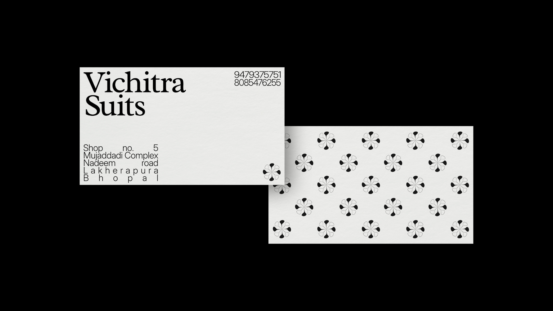
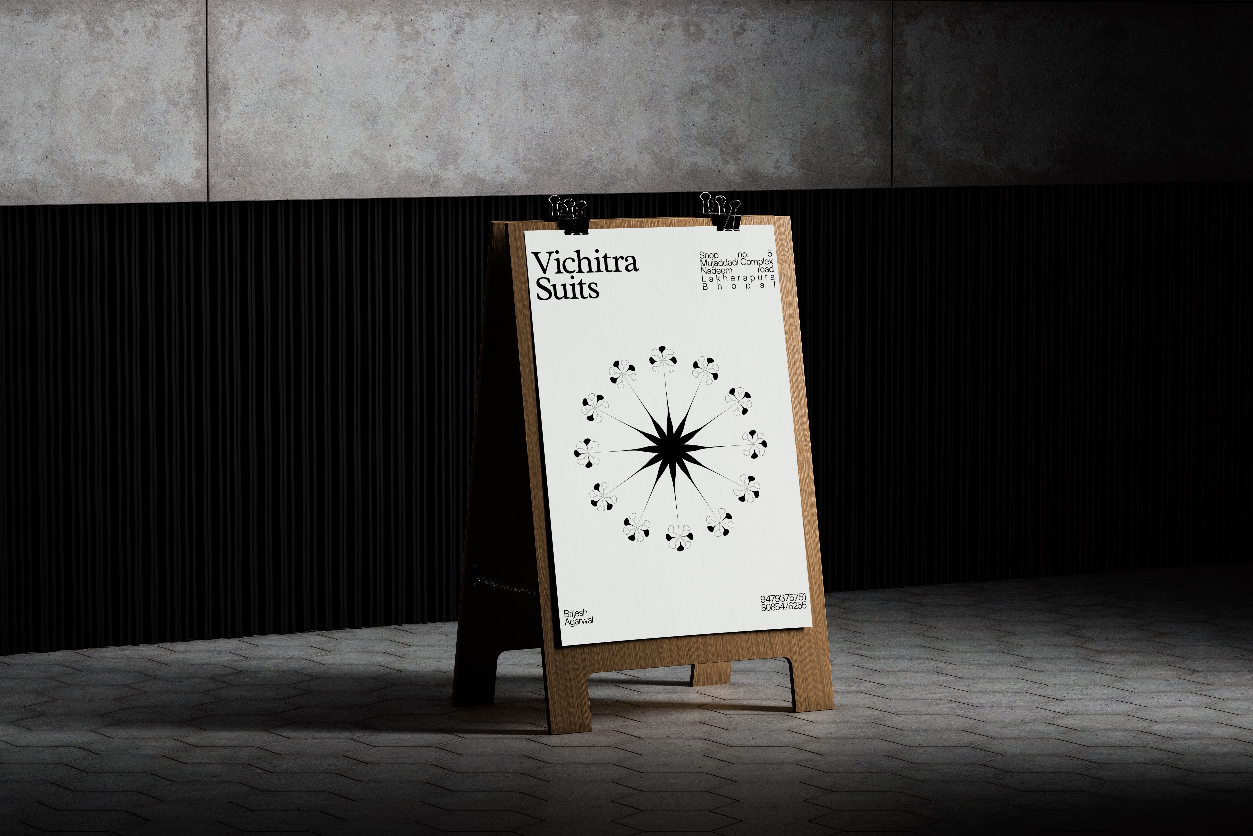
Starting with the new logomark used all across the identity, a simple but elegant Wordmark with the store’s name in beautiful serif, Radley, by Vernon Adams. Accompanying this title set in Radley comes, Inter Display, to give a clean modern aesthetic to the identity. Going along with this is an emblem made with care, inspired and incorporating the Indian traditional patterns most widely used element, a Flower. Made in an abstract sense of style in its form, it adapts to various aspects of the identity, from bags to sign to posters to marketing assets.


Testing and experimenting lead to various emblem and pattern creating shapes, which were rejected in favour of the current one. The finalised emblem was also reached on by major modifications, to remove its striking-ness which was polarizing it from other elements.
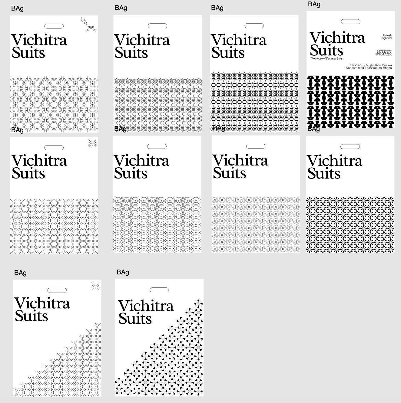

Along with this came the concept of stretching the parts of emblem to create a versatile flowing emblem, majorly used in all of the things.


Keeping in mind client’s budget and direction-ary constraints, the colour palette is kept at a couple, White and Black. While the clothing store is full of vibrant colours and combinations, the White & Black combo gives huge versatility for the future, and goes along with the philosophy of the brand, of timelessness and long-lasting products. The identity is fully black on white to separate it from other store’s in its environment.

Cycled through various designs, the main element of focus for the identity is in the shopping bag that also acts as a big business card with its simple but structured positioning of elements, along with keeping the flow, a major part of clothing and fabric.
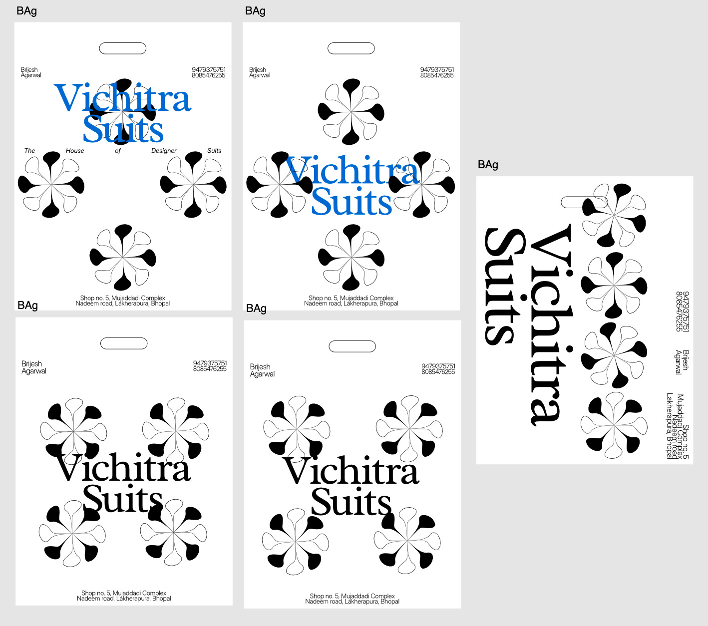
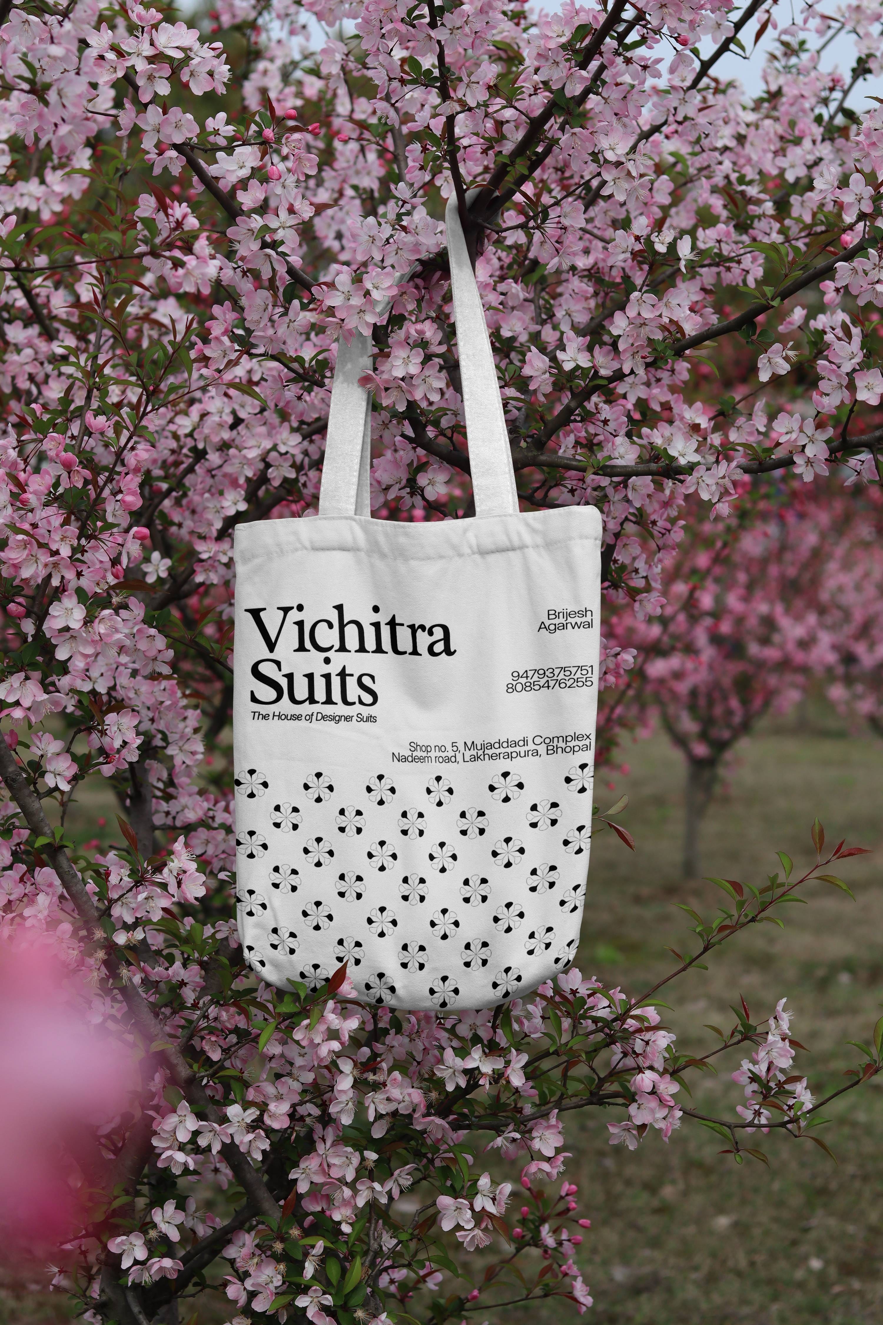
The information about the store like address, and phone number was a no-go agreement, as they are insanely valuable information for a small store like this one. The info is presented in tight, compact and a non-visible boxed up style that gives an invisible structure to the viewer’s eyes to hold on to.


The final identity establishes the store’s thinking and presents it in an engaging and elegant form of age-old beauty and forward looking conjuncture.